
You’ve spent real money making your living room feel like home. The throw pillows are fluffed. The shelves are styled. You might even have a little tray situation going on the coffee table. But here’s something the design world quietly knows that most homeowners don’t: a handful of extremely common decor choices are setting off alarm bells the moment a trained eye walks through the door.
This isn’t about shame – it’s about awareness. Some of these items are things millions of people own right now. A few of them were genuinely trendy just a few years ago. But according to designers, they’ve crossed the line from stylish to dated, from charming to cringe. Keep reading, because some of these will feel very, very familiar.
1. “Live, Laugh, Love” and Other Word Art Signs
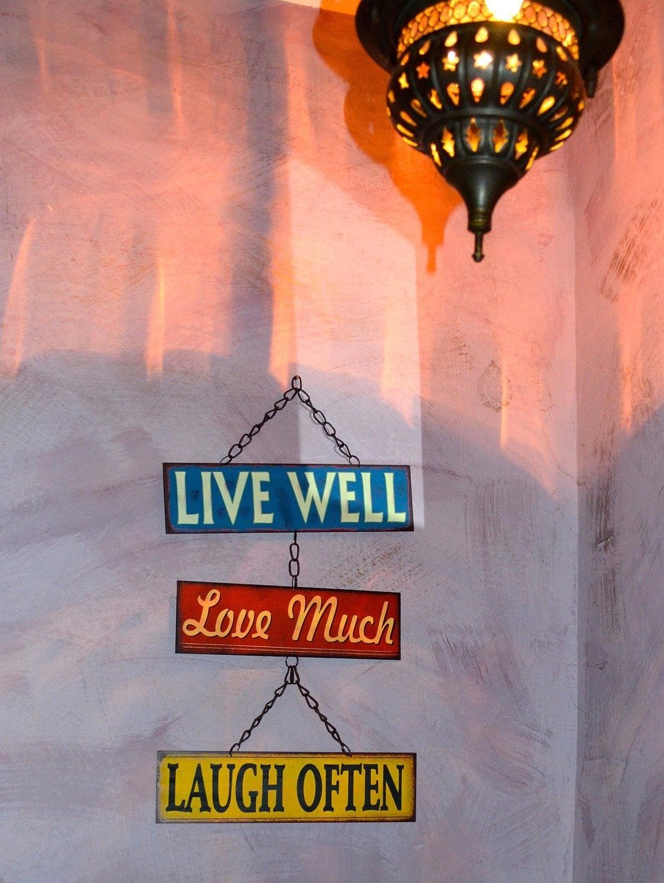
“Live, Laugh, Love” signs may be showing up less in 2026, but word art hasn’t disappeared completely – and that frustrates designers who think these pieces are generic and passé. The core problem is that a sign telling you how to feel is doing the opposite of what good design should do: show, don’t tell.
Designers argue your space should reflect your personality through how you live in it, not through literal instructions on the wall. If you love typography, the advice is to invest in actual art or vintage finds with character – something that says something specific about you, not something mass-printed for every living room in America.
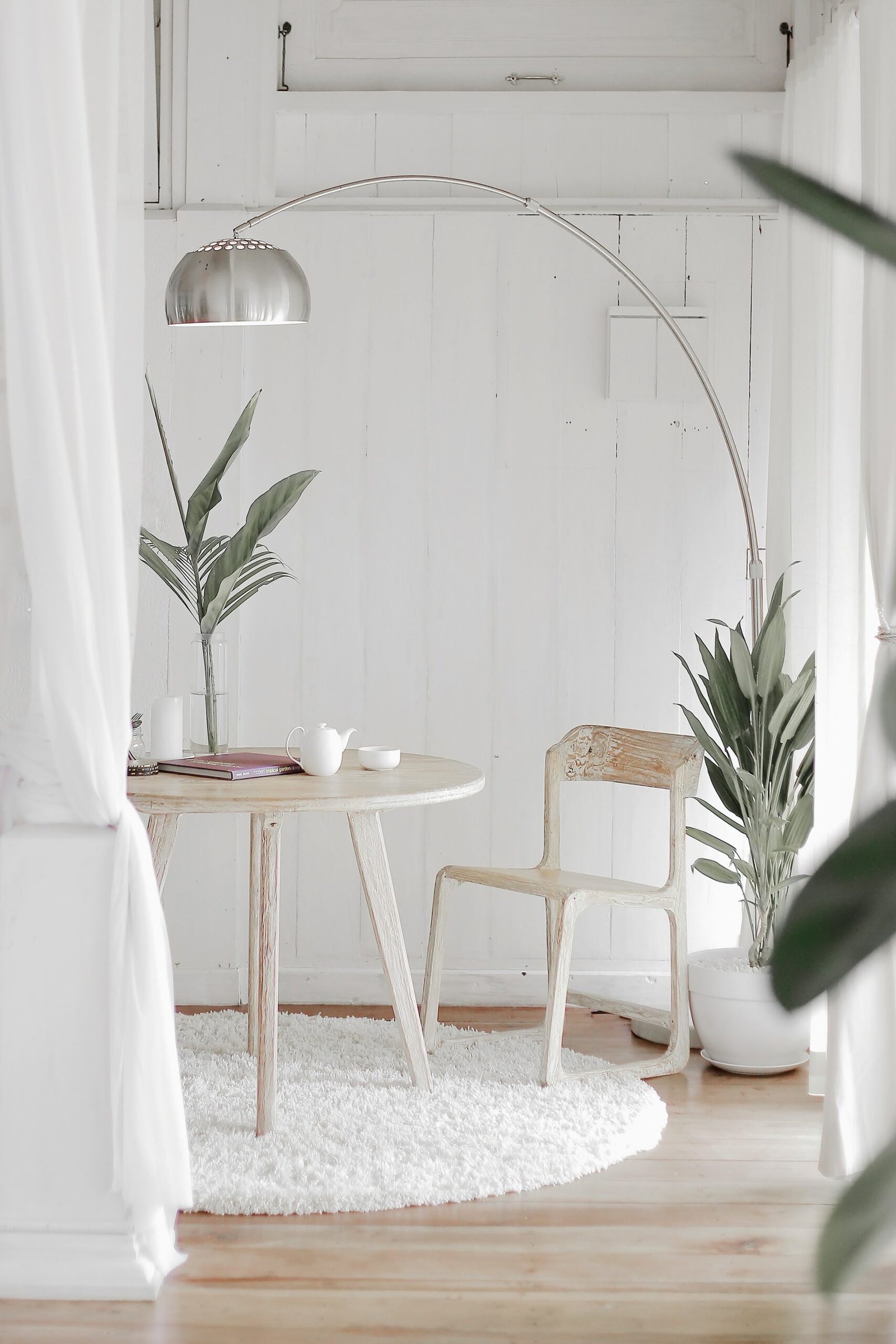
2. Cheap Fake Plants With Dusty Plastic Leaves
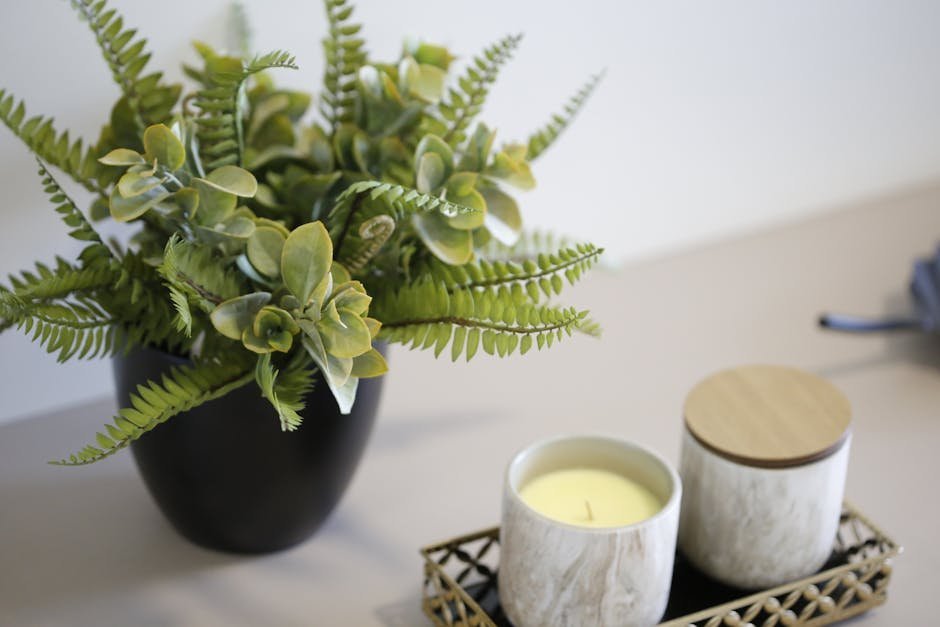
Low-quality faux plants and flowers are considered one of the fastest ways to diminish the overall polish of any space, especially living rooms. When the scale, texture, and color feel artificial, it can make even a well-designed room feel less elevated due to the lack of visual harmony. That plastic sheen is visible from across the room, and no clever styling trick can fully hide it.
Artificial greenery is collecting more dust than compliments these days. While once considered a low-maintenance alternative, fake plants can read as “I couldn’t be bothered” rather than “botanical enthusiast.” Even worse are the dust-covered specimens that haven’t been cleaned since installation. If you can’t maintain the illusion, you’re better off with a single real succulent or nothing at all.
3. The Perfectly Matched Furniture Set
Ultra-coordinated furniture – whether it’s part of a set or just too matchy-matchy in general – reads as “tacky” in any home, according to designers. These sets tend to flatten personality, lack creativity, and make a space feel dated and not at all curated. That sofa-loveseat-armchair trio from the same collection is the living room version of wearing a head-to-toe matching tracksuit.
Furniture sets are a quick and easy way to get your place set up, but they end up looking more cookie-cutter than curated. As one designer puts it: “Gone are the days when every piece of furniture needs to match perfectly – an aesthetic that feels cold, lackluster, and outdated.” The fix is simpler than you think: mix one vintage piece in and suddenly the whole room has a personality.
4. Shiplap on Every Wall
Shiplap is a trend designers aren’t loving in 2026, and the complaints have only grown louder since. What started as a charming farmhouse nod got copied into every possible home – suburban ranches, condos, urban lofts – until it lost all meaning. The horizontal planks that once felt fresh now read as a shortcut.
There are so many places shiplap is being used, and it’s considered “just so overplayed.” Using it as a feature wall is particularly questionable: the whole point of a feature wall is to make it special, but shiplap makes it feel builder-grade. To some eyes, it reads as playing it too safe. If your living room has shiplap anywhere, you might want to look at it with fresh eyes.
5. The Sliding Barn Door
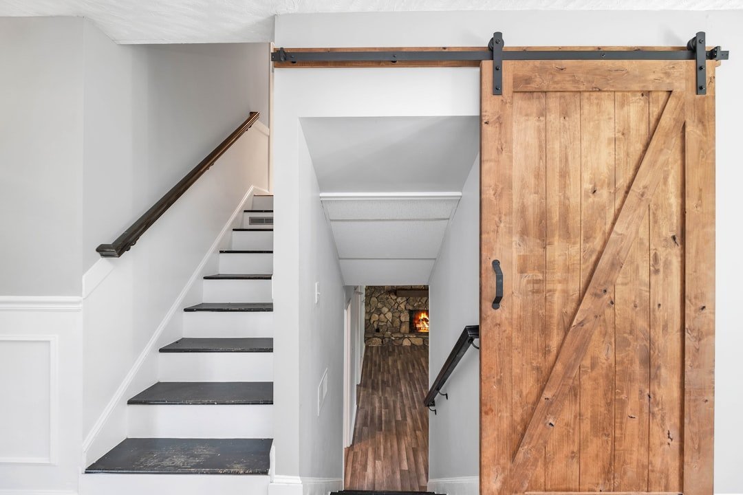
Sliding barn doors somehow migrated from actual barns into suburban homes and were slapped onto every possible doorway regardless of architectural style. Beyond their questionable aesthetic in non-farmhouse settings, they’re functionally problematic too – the privacy issues alone make them questionable for bathrooms, not to mention the noise factor as they rumble along their tracks.
Designers are ready to officially let the barn doors go. As one put it: “The modern farmhouse aesthetic had its time; it brought warmth and approachability, but now it’s everywhere, and it all feels the same. It’s lost the charm that made it special in the first place.” In a living room, especially, that industrial rolling hardware just looks out of place – and everyone knows it.
6. The Overdone Farmhouse Aesthetic
Too much rusticity in a newly constructed home is an immediate red flag for designers. Having a blank box of drywall loaded up with antiques, rustic textures, wagon wheels, faux old barn wood, and “gather” word signs is part of the modern farmhouse look that many feel died years ago. A little farmhouse warmth goes a long way. A whole room of it feels like a stage set.
Designers share the view that a hint of farmhouse can be great, but distressed wood, vintage signs, and all-gray furniture have run their course. The living room shouldn’t feel like it’s trying to convince you it was built in 1890 when it was clearly finished last Tuesday. Lean into one or two genuine vintage pieces instead of theming the entire space.
7. The All-Gray Everything Room
From gray walls to gray furniture, gray flooring, and even gray decor accessories, this obsession with gray has created homes that feel more like corporate waiting rooms than personal sanctuaries. The lack of contrast or personality makes these spaces feel cold and impersonal. Gray had a remarkable run – roughly a decade of total dominance – but it has officially overstayed its welcome.
Gray interiors dominated for over a decade, but cool neutrals are officially on their way out. Designers note that the stark cool tones of whites and grays are out, and that excessive use of cool neutrals can make a room look and feel sterile. If your living room feels like it was designed by a cloud, it might be time to bring in some warm earth tones or a real accent color you actually love.
8. The Bouclé Sofa (When Everything Else Is Also Bouclé)
If designers could leave one trend behind, many point to bouclé. When it first arrived, it felt fresh, adding a soft, nubby texture that made furniture look nuanced and modern. But now it’s everywhere – every sofa, every chair, every ottoman – and it’s become oversaturated. The texture itself isn’t the problem; the problem is that it became the default answer for every soft surface in the room.
Designers note that while the nubby texture is appealing, the fabric has become ubiquitous and doesn’t always hold up to wear and tear. Bouclé pills, snags, and shows dirt in ways that aren’t immediately obvious in the showroom. More designers are moving toward vintage fabrics instead, taking inspiration from cozy, country-style interiors rather than stark, overly curated spaces.
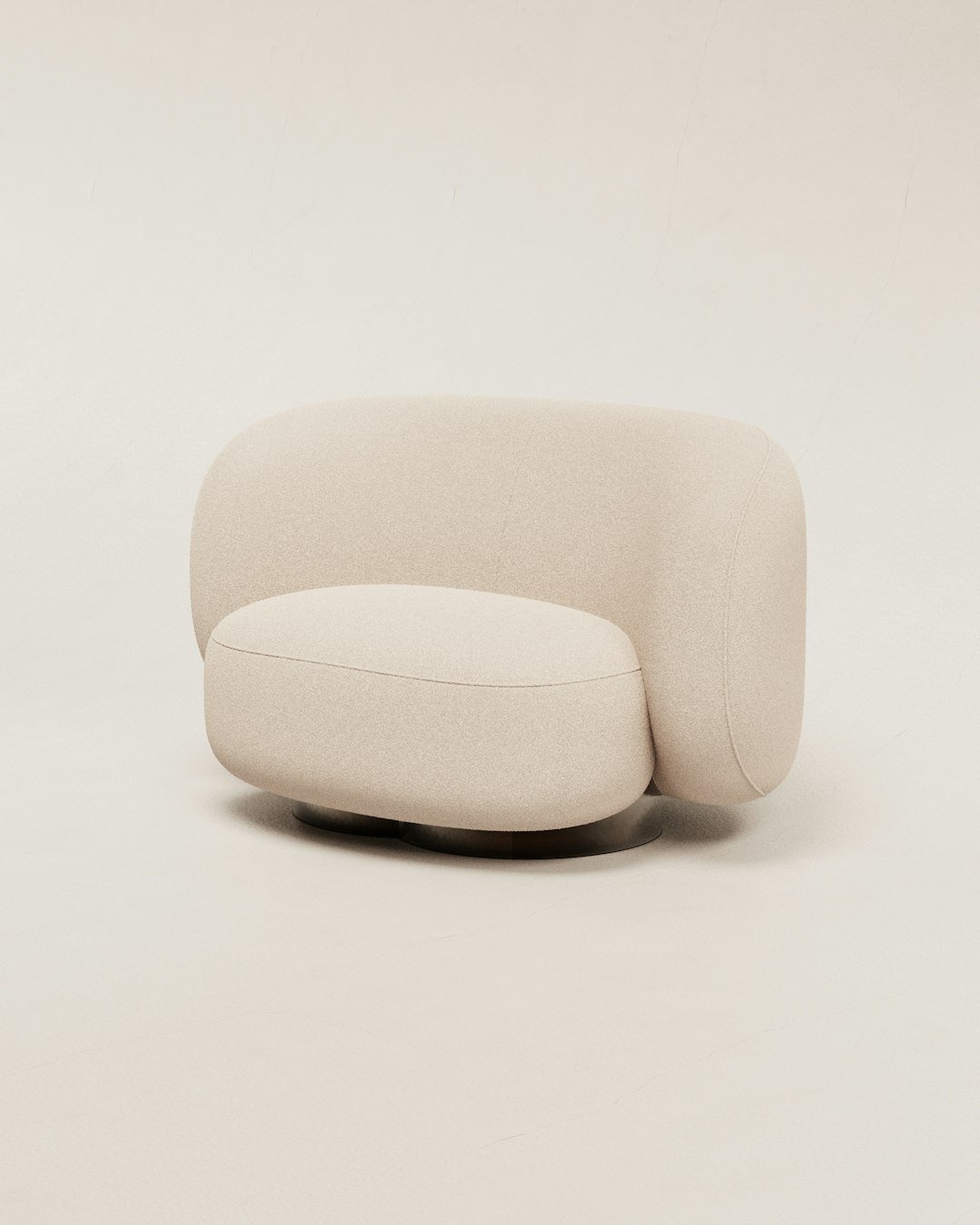
9. Oversized Bubble or Cloud Sofas
Those plush, marshmallow-style sofas can make you feel like you’re lounging on cloud nine, but designers describe them as the “design equivalent of a sugar rush.” It feels indulgent at first, but the appeal fades quickly once you realize it overwhelms everything around it. These pieces blur all the architectural lines of a living room and replace them with one soft, amorphous shape.
The visual problem is real. A sofa that takes up the entire visual weight of a room leaves no room for anything else to breathe – no art, no rug, no interesting lamp gets a chance to shine. Designers hope the masses will move toward sofas with sleek lines and a sense of refinement, noting that you can still create comfort, but with proportion and discipline.
10. The Accent Wall (Especially That One Painted Color)
Accent walls were a strong trend a few years back, but are now on the way out. They usually end up looking awkward, and it’s actually more harmonious to paint the entire room. That one wall painted a deep teal while the other three are off-white is a hallmark of a specific decorating moment – one that has clearly passed.
The randomly boldly painted dining room wall, or the one living room wall covered in geometric wood panels – these were the kinds of accent walls that were super trendy in the 2010s and now feel out of place. The good news: repainting is one of the cheapest fixes in decorating. Paint all four walls the same color and your room will instantly feel more intentional and grown-up.
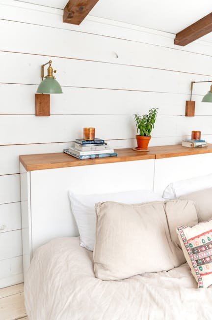
11. The Fiddle Leaf Fig (Still Sitting There from 2018)

Once the “it” plant of Pinterest boards everywhere, the fiddle leaf fig is officially passé. Interior designers now call it the houseplant that locks your home into the late 2010s. It became so ubiquitous that it stopped being a statement and started being a punchline. Walking into a room and spotting one now is like spotting a mason jar centerpiece – it places you in a very specific time.
Here’s the thing: fiddle leaf figs are also notoriously difficult to keep alive. So if yours is thriving, good for you. But if it’s half-brown and dropping leaves in the corner of the living room, it has officially become a liability. A healthy snake plant, a trailing pothos, or even a beautiful olive tree brings far more life to a room in 2026.
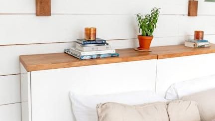
12. The Predictable Floating Shelf Display
The minimalist floating shelf had its moment, but designers are increasingly seeing these wall-mounted platforms as dust collectors displaying identical styling formulas across homes everywhere. The predictable arrangement – a stack of books, a small plant, a framed photo, a random object – has become interior design’s version of paint-by-numbers. Open any Instagram home account from 2020 to 2023, and you’ll see the same shelf, copied identically in thousands of living rooms.
Beyond their visual ubiquity, these shelves present practical problems, too. Their limited weight capacity restricts what can be displayed, while their shallow depth often means items appear awkwardly perched rather than properly placed. If you have these shelves, the move isn’t necessarily to remove them – it’s to style them with something genuinely personal instead of the Instagram template.
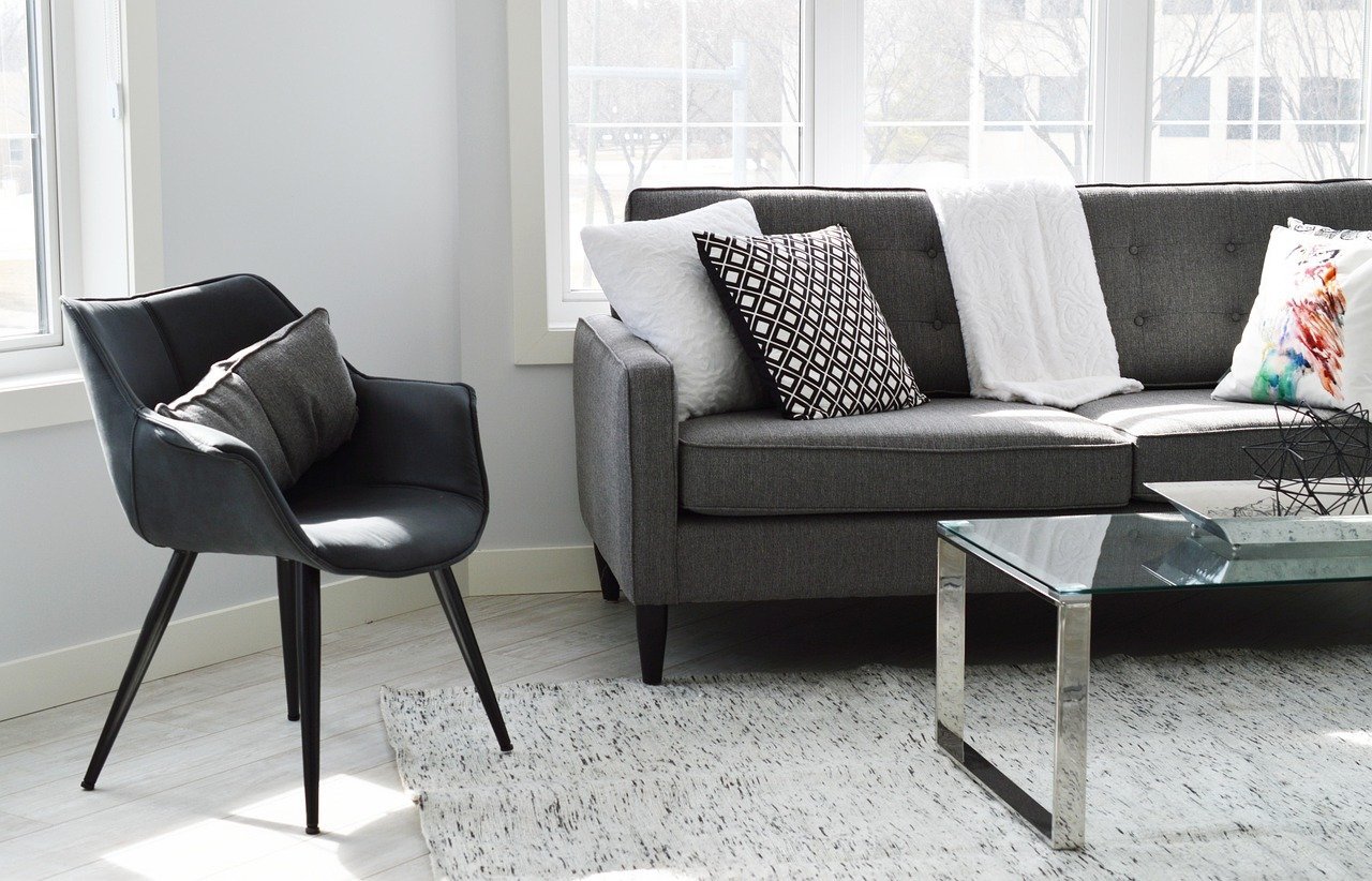
13. Throw Pillows Stacked Beyond All Reason
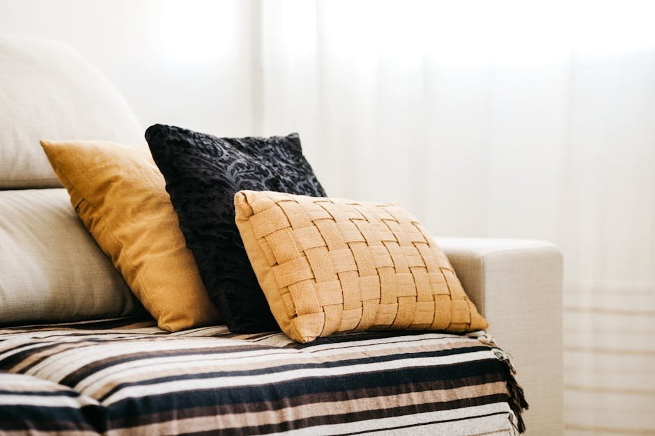
There is a point at which throw pillows stop decorating a sofa and start swallowing it. Designers consistently flag the over-pillowed couch as one of the clearest signs of someone who styled their room to look like a showroom photo rather than a place where real people sit. When you need to remove seven pillows just to use the furniture, something has gone wrong.
Interior designers agree that outdated home decor trends often result in spending money on pieces that lack quality and functionality. Trends that deviate from an organic, personalized style – like over-accessorizing every surface – are on their way out. Two or three well-chosen pillows in good fabric will always look more confident than twelve pillows in a rainbow of competing patterns. Quality over quantity, every time.
14. Acrylic and All-Glass Furniture

Sacrificing function for beauty is a trend some designers are eager to leave behind, with glass and mirror coffee tables being a prime example. As one designer puts it: “Nobody can set their drink on them or let their kids close enough to breathe near them.” Glass coffee tables look stunning in magazine photos – and collect fingerprints and smudges in about thirty seconds of real life.
Similarly, acrylic furniture has drawn strong criticism from designers. “I don’t like to use the word ‘hate,’ but I hate acrylic furniture,” says one Queer Eye designer. “It scratches, and it always looks dusty.” That ghost chair or acrylic side table that looked so sleek at the store has a way of looking foggy and tired within months. It’s the kind of piece that photographs better than it lives.
15. The Overdone Bubble Mirror
Social media had its moment with viral decor buys like giant arches, bubble mirrors, and checkerboard rugs – but what looks great in a swipe of a TikTok video rarely sustains in everyday life. Pieces that dominate the room or feel gimmicky are being swapped for designs with staying power. The bubble mirror in particular became so widespread so fast that it stopped feeling original the moment it arrived in most homes.
A mirror is a powerful design tool – it adds light, depth, and architectural interest. But a trendy novelty mirror tied to a single social media moment has a very short shelf life. Once the trend cools, it reads as a dated artifact rather than a considered design choice. An antique or vintage mirror with real character will outlast any TikTok wave by decades.
16. Vertical Blinds on Living Room Windows
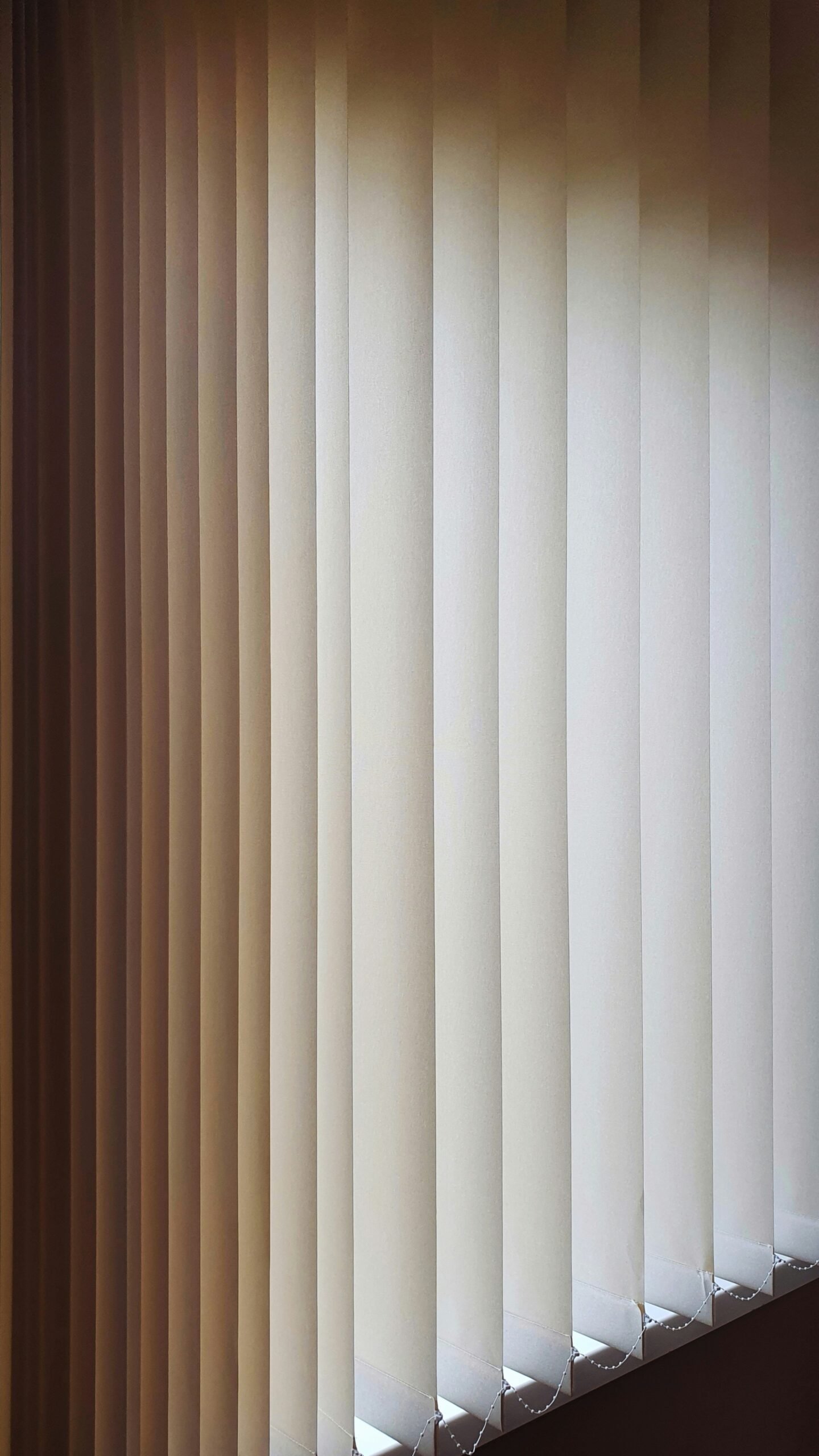
While open shelving once dominated kitchen discussions, vertical blinds have also landed squarely on the out list, replaced by sleeker, more functional window treatments like Roman shades. Vertical blinds have a specific association that’s very hard to shake: the office waiting room, the rental apartment you moved out of in your twenties, the DMV. They make natural light feel institutional rather than inviting.
Leaving windows bare doesn’t make a room feel inviting and comfortable, but besides paint, window treatments are the easiest and least expensive way to change the look of a room. Replacing vertical blinds with floor-length curtains or simple Roman shades is one of the highest-return updates you can make in a living room for relatively little money. The room will feel completely different overnight.
17. Fast Furniture That Already Looks Tired
Mass-produced, low-quality furniture is being replaced by durable, timeless pieces. Experts note a clear shift toward sustainability and repurposing pre-loved items, moving away from disposable design. That particleboard entertainment center or the sofa that came in a flat box and started sagging after eighteen months is exactly the kind of piece that trained eyes clock immediately. The finish looks printed on. The edges sag. It says “temporary” even when it isn’t meant to.
Consumers are becoming more environmentally conscious, which means there is a downtick in fast furniture that will someday end up in a landfill. Instead, people are choosing to invest in quality pieces that will stand the test of time. As part of this movement, secondhand and vintage pieces continue to soar in popularity. One genuinely solid vintage chair from a thrift store will outlast and outperform three fast-furniture pieces from a big-box sale.
18. The Stark All-White Room
Airy and neutral has its place, but many designers are tired of “white on white on white.” An all-white room is compared to a set design – it lacks personality and a point of view. It’s also simply not practical, especially with kids or animals. The all-white living room was everywhere in the early 2010s, peaked on Instagram, and now reads as a room that was decorated for the camera, not for the people who live in it.
Minimalist designs characterized by stark whites, bare walls, and sparse furniture are being replaced by warmer, more personalized spaces. The shift is clear: designers and homeowners alike are gravitating toward creamy warm whites, earth tones, and rooms that feel like someone actually lives there. A little warmth – a terracotta lamp, a warm-toned rug – changes everything about a white room.
19. Fully Barbiecore Pink Rooms or Walls
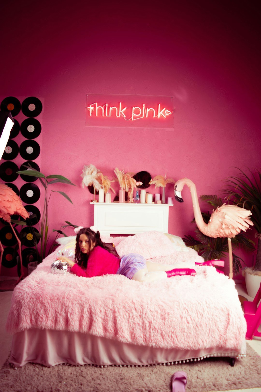
What once felt playful on TikTok has officially turned dated in 2026. Homes drenched in hot pink – from walls to furniture – are now part of the fading Barbiecore craze, read as overwhelming and juvenile. A few pink accents are fine, but full-on candy-colored décor is chaotic and dated. The trend had an incredibly fast lifecycle: it surged in 2023, peaked in 2024, and is already an eyebrow-raiser in 2026.
Designers are retreating to earthier, grounded color palettes – soft greens, warm neutrals, and natural textures – leaving Malibu Dreamhouse-style interiors and the bubblegum craze firmly in the past. If your living room has a full pink wall or a candy-pink sofa, the update doesn’t require a full renovation. A warm linen slipcover or a single repaint can bring the space back to something that will age well.
20. Generic Coffee Table Books Styled as Decor
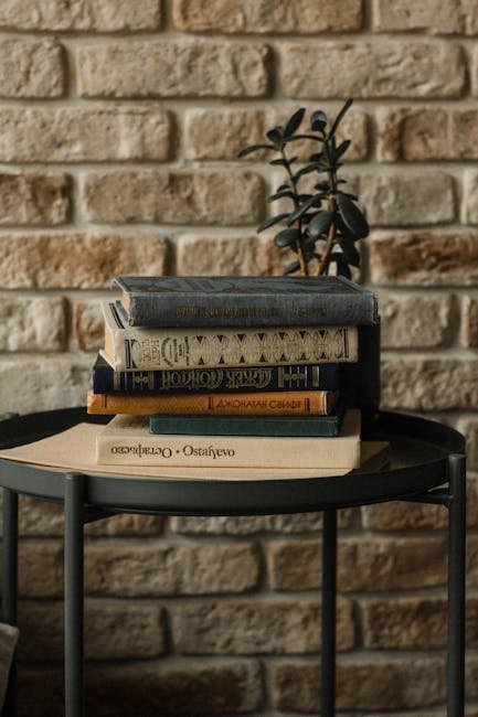
Designers are urging people to replace tacky word art and generic coffee table books with decor details that are much more personal. In 2026, cliché word art and generic coffee table books are being called out as substitutes for genuine personality. The stack of three oversized art books you’ve never opened – with the spines turned inward to show only white pages – is a staging trick that has officially been spotted and retired by anyone paying attention.
The overly perfect stack of books, the untouched sculptural object, the chair no one can sit in because its silhouette is more concept than function – these choices might perform well online, but they rarely support real living. A few books you’ve actually read, stacked casually, will always feel more honest and interesting than a curated prop pile. Real life is the most compelling design choice of all.
21. The Checkerboard Everything Moment
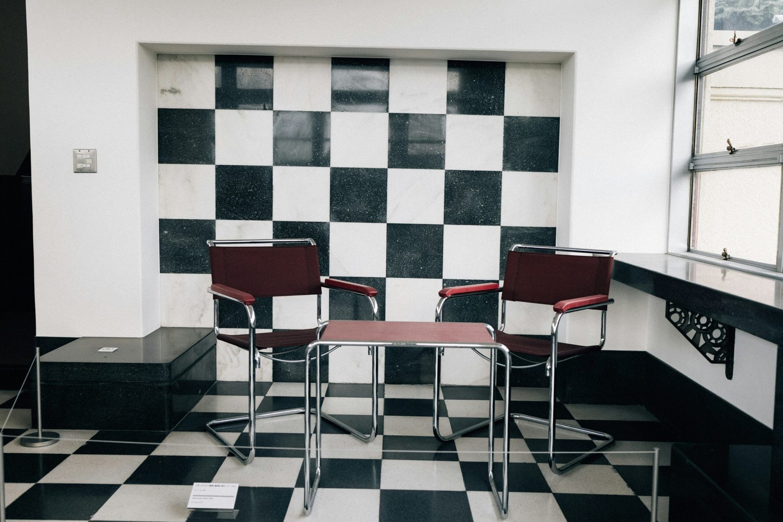
Checkered textiles, vases, rugs, and furniture are fads that many enjoyed incorporating, but designers see them fading as we move forward. This motif is simply too saturated in the market. The checkerboard pattern had a genuinely exciting revival – it felt retro, bold, and fresh all at once. And then it appeared on every rug, every tray, every throw blanket, and every HomeGoods shelf in America simultaneously, which is the design equivalent of a song being played to death on the radio.
Design commentators agree it is time to cool it a bit on checkerboard patterns. If you have one checkerboard piece and it genuinely speaks to you, keep it. But if you accidentally assembled a checkerboard collection – rug, tray, and vase all at once – it might be time to edit. The pattern itself isn’t the problem. The volume is.
Here’s the truth: none of these items means your home is a failure. Most of them found their way into millions of living rooms for a reason – they were affordable, they were everywhere, and they looked great in a photo. The difference between a room that feels curated and one that feels dated is usually just a handful of swaps, not a total overhaul. The goal isn’t a perfect room. It’s a room that actually feels like you – not like a trend that peaked three years ago. Which one of these did you spot in your own space?