
Most people think a living room only looks dated if the furniture is falling apart or the carpet is from 1987. Turns out, that’s completely wrong. Interior designers say some of the biggest offenders are items that felt totally fresh just five or six years ago – things you deliberately bought to modernize your space. The problem isn’t that your taste is bad. The problem is that certain trends burned so hot, so fast, they aged almost overnight. And guests notice the second they walk in the door.
What’s wild is that the list includes some of the most Instagrammed, most pinned, most copied looks of the last decade. If your living room features more than two or three of these, it’s silently telegraphing a very specific era to every visitor. Here’s what designers are actually saying – and a few of these answers will genuinely surprise you.
#14 – The All-Gray Everything Color Palette
Gray ruled living rooms for the better part of a decade, and it seemed bulletproof – clean, neutral, endlessly versatile. Except it wasn’t. The all-gray living rooms of the 2010s are considered so last decade by designers, with one noting that “monochromatic gray often drains the life out of a room.” The result is a space that reads as cool and clinical rather than warm and welcoming – and guests feel it the moment they sit down.
Designer Sturgess agrees that decorating a space using solely one hue will make it “feel flat and dated,” arguing instead for a layered, collected interior that incorporates a mix of textures, colors, and timeless furnishings. The fix doesn’t require a full renovation. Warm neutrals, terracotta accents, or even a single bold throw pillow can start pulling a gray room back from the edge. But the all-gray look as a standalone statement? It’s been clocked.
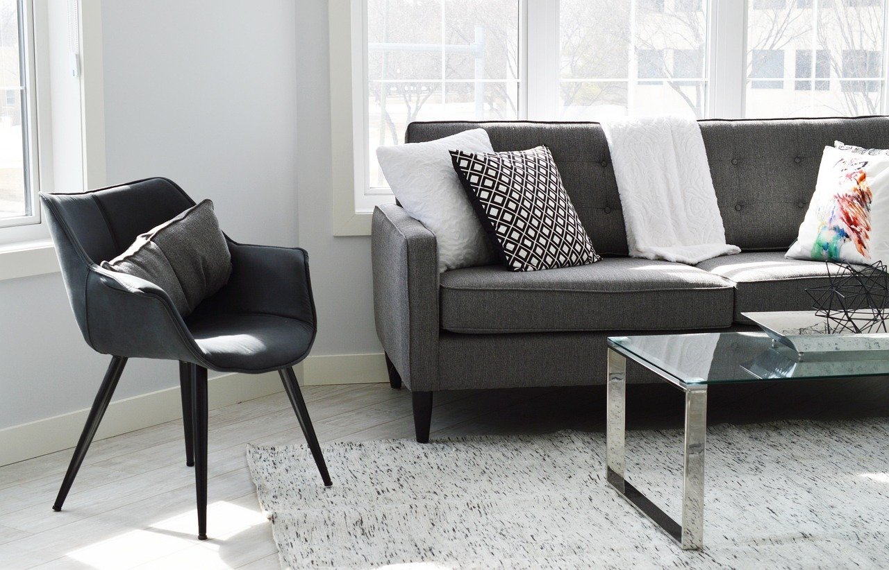
#13 – The Matching Furniture Set Straight Off the Showroom Floor
You know the look: sofa, loveseat, and coffee table all from the same collection, same finish, same tag. It felt like a shortcut to a “done” room. Designers now say it’s the fastest way to signal you haven’t thought much about the space at all. Designer Dominique DeLaney calls “overly coordinated furniture sets” the biggest calling card of a dated living room, explaining that “a perfectly coordinated sofa, loveseat, and coffee table might feel like a shortcut to cohesion, but it robs the room of character.”
Matching furniture sets are fading away because “they can make a living room look too uniform and lacking in personality,” with people now embracing a mix-and-match approach combining various textures, materials, and styles for a curated, personalized aesthetic. The sweet spot designers keep pointing to is pairing one vintage or worn piece next to something sleek and modern – the tension between the two is what actually makes a room feel intentional rather than assembled.
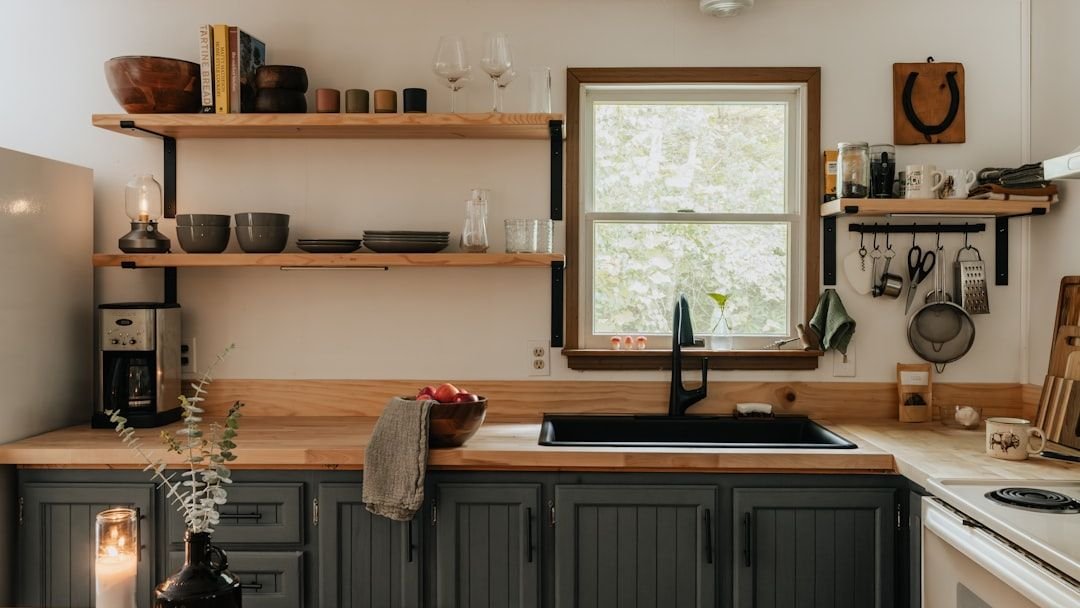
#12 – The Farmhouse Shiplap Feature Wall
Shiplap had a good run. A genuinely great run. But that run is officially over for most homes. Shiplap is another farmhouse trend most people are over – the problem wasn’t the shiplap itself, but the fact that everyone started putting it up regardless of whether the style of their home suited it, resulting in something that felt out of place and needlessly rustic. When something is copied that indiscriminately, the charm evaporates fast.
When Joanna Gaines popularized shiplap on Fixer Upper, she sparked a design movement that dominated American homes for over a decade, with search interest for “modern farmhouse” surging through 2024 and over 2.3 million social media posts tagged with the aesthetic. That level of saturation is exactly why it now reads as a time stamp rather than a design choice. Barn doors and shiplap are being replaced by cleaner pocket doors and limewash plaster or board-and-batten wainscoting with more sophisticated proportions.
#11 – The Sliding Barn Door
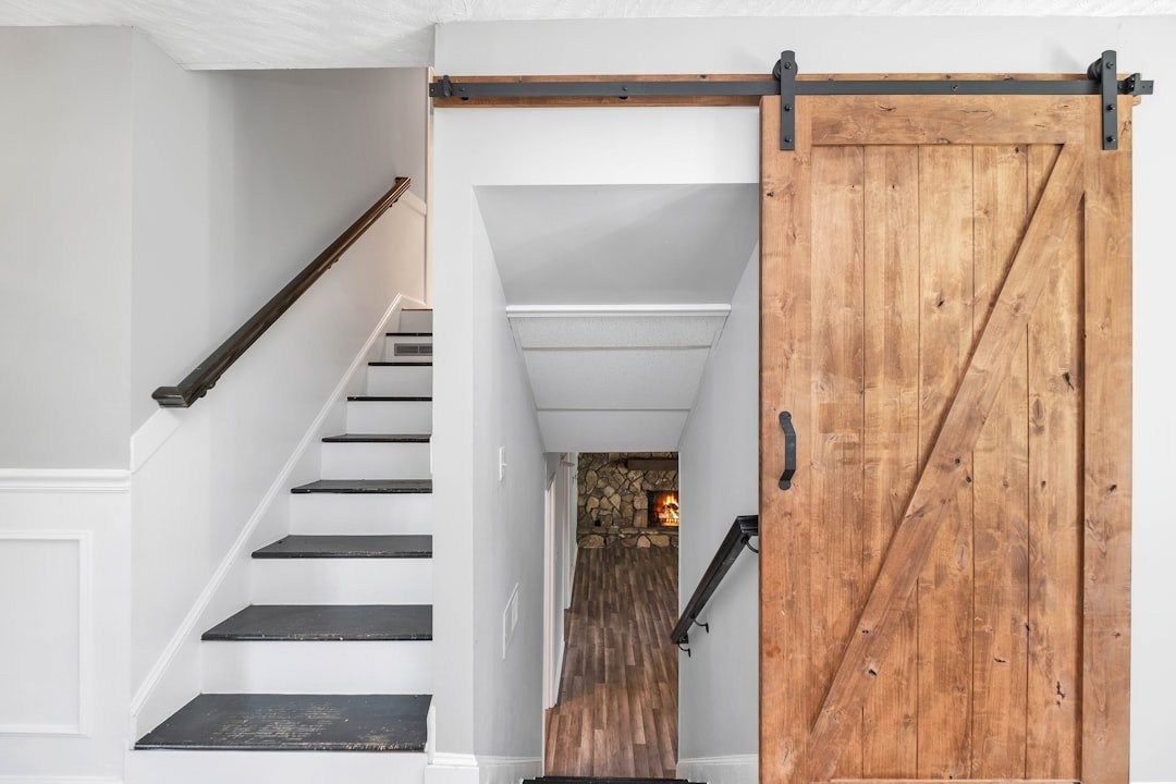
Few things screamed “modern farmhouse circa 2016” louder than a sliding barn door on an exposed black track. And few things are aging quite as visibly now. Sliding barn doors have gone from “charming rustic touch” to “overdone farmhouse cliché,” and designers aren’t shy about saying it. The functional argument for them was always thin anyway – they never sealed properly, and sound traveled through them like they weren’t even there.
The sliding barn door trend of the 2010s was one of the biggest modern farmhouse elements copied everywhere, but people started realizing it wasn’t practical – especially on bathrooms where the sliding barn door never really closed or provided any privacy. The farmhouse trend that drove barn doors’ popularity has evolved, with people now craving timeless, versatile design over things that scream “trend of the decade” – a barn door that looked chic in 2015 can feel dated now, especially paired with other rustic elements.
Is Your Living Room Stuck in the Past?
Interior design trends move fast, and what felt modern five years ago might be dating your home today. Test your eye for design with this quiz based on expert insights.
Think you caught the key details? Take the quick quiz and see how sharp your instincts really are.
#10 – The Bold Accent Wall in a Single Paint Color
One wall painted a deep navy or terracotta, with the other three staying white – this was the low-effort, high-impact move of the 2010s. The idea was to create a focal point without committing to a full repaint. Designers say the execution almost always backfired. Designer Emily Sturgess considers both accent walls and shiplap wall coverings to be “some of the worst offending trends that will make your space look like a time warp.” The random single bold wall now reads as a decision made on impulse rather than as part of a cohesive design plan.
Once trendy, accent walls in bold colors are being phased out in favor of cohesive color schemes, with homeowners now preferring a consistent flow of color throughout a room instead of a single bold wall. The smarter move today is either committing to a full color story – walls, trim, and ceiling – or using texture like limewash plaster or decorative molding to create interest on a single wall without the jarring contrast. The random bright wall is the interior design equivalent of a half-finished project.
#9 – The All-White, Everything-Crisp Interior
For a while, white walls, white sofa, white rug, white accessories felt aspirational – airy, clean, magazine-ready. The reality guests experience is something closer to a hospital waiting room. All-white color palettes, with their crisp white walls, sofas, rugs, and accessories, are now on their way out, with homeowners seeking enveloping, textured spaces instead. White as a dominant, singular statement simply reads as an absence of decisions rather than a stylistic one.
One designer describes ultra-minimalist, all-beige and all-white interiors as the top of an oversaturated list, noting that “when every surface, fabric, and wall reads the same tone, it risks feeling sterile rather than soulful” – and that “design should feel layered, intentional, and alive, not stripped of character.” The shift is toward warm whites layered with natural linens, oak, and handwoven textiles rather than a stark uniform palette. All white no longer signals sophistication – it signals a lack of commitment.
#8 – Oversized Word Art and Motivational Sign Décor
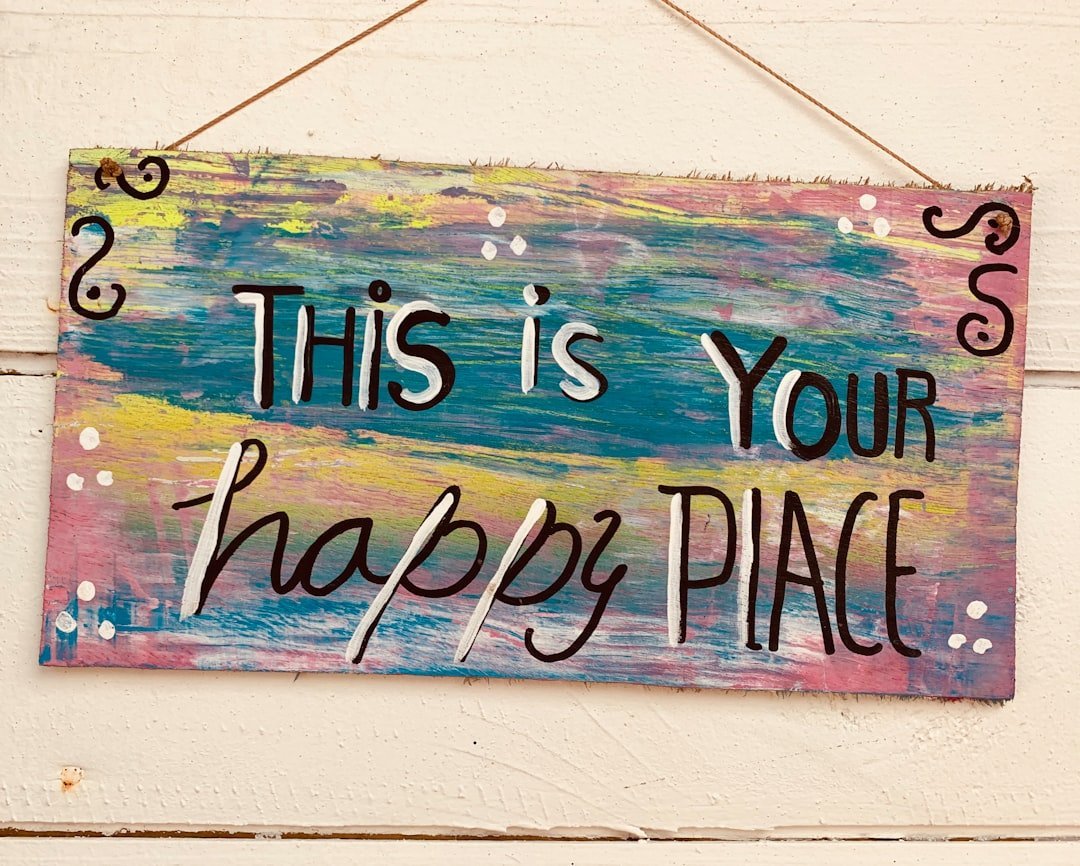
The “Live, Laugh, Love” era is well and truly over – and it’s dragging a lot of companions down with it. “Gather” signs above the dining table, “Blessed” in script above the couch, framed quotes about coffee – these pieces were mass-produced at the exact scale that kills a trend. Designers see a clear shift away from the overly distressed “shabby-chic” look, including whitewashed furniture and “the overuse of word art signs,” with homeowners now looking for a more refined and sophisticated aesthetic.
Designers are specifically calling out signs reading “Gather,” “live, laugh, love,” “Welcome to the farm,” and “blessed” as items to skip entirely. The problem isn’t just that these pieces look dated – it’s that they were never really personal in the first place. They were bought off the shelf precisely because they were generic. Guests see them and immediately recognize the aesthetic era, not the homeowner’s personality. Replacing them with actual art – even a simple print you genuinely love – is an instant upgrade.
#7 – The Perfectly “Staged” Open Shelving Display
Open shelving became a social media darling because it photographed beautifully: coordinated books turned spine-out, small sculptural objects, a trailing plant, a candle. In practice, inside an actual living room, it tends to look like a store display – and guests know the books haven’t been touched. Designer Rachel Blindauer calls out “the hyper-styled open shelving with stacks of books no one reads and objects without meaning,” saying “it’s looking increasingly contrived” and that “people want fewer, better things – intentionality is replacing performative styling.”
The deeper issue is that homes that feel curated solely to chase trends lack any emotional resonance, with one designer noting that “the overly perfect stack of books, the untouched sculptural object, the chair no one can sit in because its silhouette is more concept than function” might perform well online but “rarely support real living.” If your shelves look like a prop set rather than a reflection of who actually lives there, guests feel it – even if they can’t articulate exactly why.
#6 – The Bouclé Sofa or Armchair
Bouclé went from cult fabric to ubiquitous in what felt like eighteen months. The nubby, textured weave showed up on sofas, accent chairs, ottomans, and headboards simultaneously – which is exactly the kind of market saturation that accelerates a trend’s expiration date. Designer Eliza McNabb said she was sick of seeing bouclé, arguing that beyond its minimalist associations, it’s not a sustainable material and that “this fabric has become ubiquitous and, unfortunately, doesn’t always hold up to wear and tear.”
The practical problem compounds the style issue: **bouclé shows lint, pet hair, and pills faster than almost any other upholstery fabric**, making it look tired well before its aesthetic moment has passed. Guests who sit on a bouclé sofa that’s a couple of years old immediately notice the difference between the trend’s promise and its reality. The replacement direction from designers is toward vintage-inspired fabrics, performance velvets, and natural linens – materials that develop character instead of just deteriorating.
#5 – The Massive, Wall-Dominating Sectional
The oversized sectional sofa was the defining furniture piece of the mid-2010s entertainment-first living room. The bigger the better – the more people it could seat, the more impressive it seemed. The issue is that these sectionals almost always eat the entire visual weight of a room, leaving no breathing space for any other design decision you try to make. Massive sectional sofas dominated living room interiors for much of the 2010s as the seating option of choice, comfortably accommodating large families or gatherings, but in 2026, expect to see sectionals downsized in favor of more intimate seating arrangements that encourage connection.
Designers now specifically describe the look as a design dead-end. These plush oversized sofas have been called “the design-equivalent of a sugar rush” by one Washington D.C.-based designer, who explains that “it feels indulgent at first, but the appeal fades quickly once you realize it overwhelms everything around it – these pieces blur all the architectural lines of a living room and replace them with one soft, amorphous shape.” A well-proportioned sofa paired with a separate accent chair creates far more visual interest and, crucially, a room that doesn’t feel like a home theater waiting room.
#4 – The Overly Industrial Aesthetic (Exposed Everything)
Exposed brick, visible ductwork, raw concrete floors, factory pendant lights over a wooden coffee table – the industrial living room was everywhere between 2012 and 2020. It signaled a kind of cool urban authenticity. Now it mostly signals that the room hasn’t been touched in a decade. Industrial elements such as exposed ductwork and concrete floors are becoming less desirable as people gravitate toward cozier, softer design choices that feel more livable. The look has been so thoroughly replicated in apartments and starter homes that it no longer reads as raw or edgy – it just reads as bare.
The deeper problem is that the industrial aesthetic was always more about what was removed than what was added – and that blankness now feels dated rather than intentional. Guests walk into a living room with exposed pipes and polished concrete and think “renovation project” rather than “design choice.” Stark minimalism is beginning to fade in 2026, making room for a warmer, more layered aesthetic, with a strong shift toward cozy textures and colorful upholstery that adds depth and personality to a space. Industrial cold is the opposite of where the culture has moved.
#3 – DIY Peel-and-Stick Wallpaper as a Statement Wall
Peel-and-stick removable wallpaper was genuinely clever when it launched as a renter-friendly solution. You could get a bold, graphic pattern on one wall without a landlord’s permission or a professional installer. The problem is that it became immediately identifiable as a temporary fix – and in a living room, guests can often see the edges lifting, the pattern misaligning, or the telltale sheen that distinguishes it from real wallcovering. Removable, renter-friendly wallpaper skyrocketed in popularity over the last decade as an affordable, temporary way to introduce color and interest to basic walls, but as more homeowners invest in properties long-term, this temporary wallpaper solution is declining in 2025 interior design trends.
**The specific pattern choices that were most popular – large botanical prints, geometric shapes in black and white, abstract watercolor brushstrokes – have become so associated with a very specific 2018–2022 aesthetic that they now date a room almost precisely.** Instead of quick DIY paper upgrades, more homeowners are opting for high-quality wall finishes built to stand the test of time, from sophisticated grasscloth and metallic wallcoverings to hand-painted murals and textural slatwalls. The upgrade in quality is immediately visible to anyone who walks through the door.
#2 – The Faux Finish or Fake Material Surface
Faux marble contact paper on a coffee table. Vinyl flooring printed to look like hardwood. Plastic décor pieces finished to mimic aged brass or raw concrete. These materials exploded in popularity because they delivered the look at a fraction of the price – but they also deliver the fakeness at full volume to anyone who gets close. Faux materials like artificial marble, wood, and stone are becoming less popular as homeowners are increasingly drawn to real, sustainable materials that offer durability and an authentic feel.
This is arguably the single item on this list that guests clock fastest, because the tactile disconnect between what something looks like and what it actually feels like registers immediately. Designers are craving more authenticity and contrast: richer palettes, collected materials, and a return to interiors that feel personal rather than performative. Real wood, genuine stone, actual linen, and authentic brass age beautifully and develop patina. Faux versions just deteriorate – and that deterioration is always more visible than the original material it was meant to imitate. Nothing signals a frozen design moment to guests quite like a surface pretending to be something it isn’t.
Is Your Living Room Stuck in the Past?
Interior design trends move fast, and what felt modern five years ago might be dating your home today. Test your eye for design with this quiz based on expert insights.
Think you caught the key details? Take the quick quiz and see how sharp your instincts really are.
#1 – The Live-Laugh-Love Farmhouse Cluster: Word Signs + Matching Set + Shiplap All Together
Individually, several items on this list can be managed or softened. But when they stack – the shiplap wall behind the matching furniture set, the word art sign above the sofa, the barn door in the corner, and the all-white palette tying it together – the effect is total design time capsule. This is the living room that screams a specific four-year window to every single guest who enters. The farmhouse checklist – “Live, Laugh, Love” signs, buffalo check everything, and distressed wood that was never actually old – had become so formulaic that by 2025, ninety-two percent of designers surveyed believe modern farmhouse is on its way out.
The reason this combination lands at number one is the sheer emotional weight it carries for guests. It doesn’t just look dated – it communicates a moment in time so specifically that it becomes the dominant impression of the room, overpowering everything else. Designer Kathy Kuo notes that “the concept of jumping on every viral fast furniture trend is coming to an end,” advocating instead for timeless, beautifully crafted pieces over trendy ones – because “it’s not sustainable to refresh your living room every time a new aesthetic with the word ‘core’ on the end of it circles around.” The living rooms that hold up over time are the ones built around the people who live in them, not around a trend cycle that was always going to move on.
The uncomfortable truth is that most of these items were genuinely appealing when they first appeared – that’s exactly how trends work. They look fresh and exciting right up until the moment they don’t. The good news is that none of these are irreversible: a coat of paint, a new throw, or one well-chosen piece from a vintage store can quietly start shifting a room away from any of these traps. The key is knowing what guests are actually seeing when they walk in – and now you do. Which one of these surprised you the most? Drop it in the comments.