
You know your kitchen better than any room in the house. You’ve made coffee in it ten thousand times, you know exactly which drawer sticks, and you stopped seeing the laminate countertop years ago. But the second a guest walks through that door, they see everything – the worn cabinet paint, the buzzing fluorescent tube, the microwave squatting on the counter like it’s been there since the Clinton administration. They take it all in within about three seconds. And here’s the uncomfortable part: they almost never say a word.
Most of these items don’t scream “outdated” on their own. It’s the combination – honey-oak cabinets next to a white plastic appliance next to a glass mosaic backsplash – that quietly files your kitchen under “hasn’t moved since 2003.” Some of the biggest culprits are ones you’d never expect. A few of them cost almost nothing to fix. Here’s exactly what your guests are noticing, counting down to the one detail that silently dates the entire room.
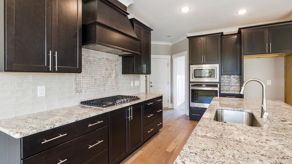
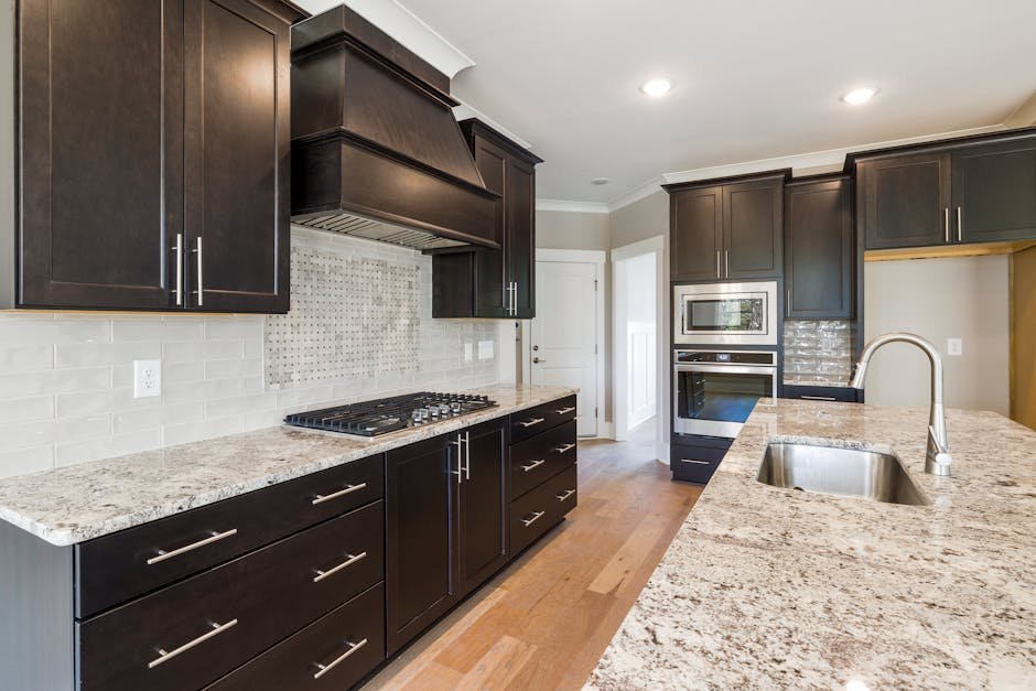
#16 – Honey-Colored Oak Cabinets

Walk into a kitchen with honey-toned oak cabinets and every guest’s brain immediately files it under “grandma’s house” – and not in a cozy, intentional way. That warm orange undertone is so strongly tied to 1980s and early ’90s kitchens that it overpowers everything else in the room. It doesn’t matter how clean the countertops are or how new the appliances look. The honey oak anchors the whole space to a specific decade and refuses to let go.
The good news is you don’t have to gut the cabinets to fix this. A coat of sage green or deep navy on the lower cabinets alone would erase decades of visual aging practically overnight. Shaker-style doors are still very much in fashion – it’s only the finish that’s the problem. Staining them darker or going with a matte painted look breaks the time-warp effect completely. It’s one of the highest-impact changes you can make with a paintbrush and a weekend.
At a Glance
- Honey oak peaked in popularity from roughly the mid-1980s through the late 1990s
- The orange undertone clashes with nearly every current countertop and hardware trend
- Painting existing cabinet boxes (not replacing them) is the budget-friendly fix designers recommend most
- Warm white, deep navy, sage green, and soft black are the cabinet colors leading renovations right now
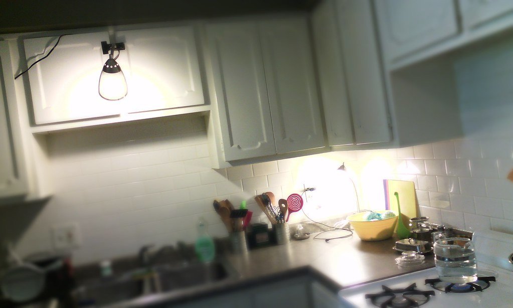
#15 – Fluorescent Overhead Lighting
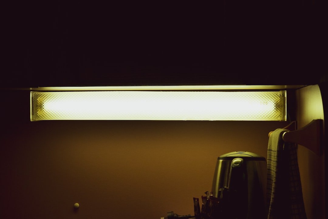
Nothing ages a kitchen faster than a long fluorescent tube humming above the sink. Guests register the quality of light before they consciously notice anything else – it sets the entire emotional tone of the room in the first few seconds. Fluorescent lighting became a fixture in North American homes through the mid-to-late twentieth century, but the flat, greenish cast it produces is now being phased out almost entirely, partly due to mercury concerns and partly because it simply makes every kitchen look like a break room at a DMV.
The fix is cheap and fast. Swap in warm-toned LED recessed lighting or a statement pendant and the entire room shifts – same countertops, same cabinets, completely different feeling. Designers who’ve staged homes for sale consistently report that replacing fluorescent fixtures is one of the first changes that makes buyers linger in a kitchen rather than hurry out of it. The difference between cold fluorescent light and warm LED glow is the difference between “functional” and “inviting.”
#14 – Glass Mosaic Tile Backsplashes
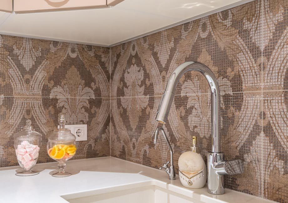
That shimmery, multicolored glass mosaic tile once felt like a genuine designer upgrade. For a narrow window roughly between 2008 and 2014, it absolutely was – HGTV made it look fresh, modern, and artistic. But guests walking into a kitchen today clock it immediately as a relic of that specific era. The varied tile sizes, the iridescent shimmer, the busy color mix – it all reads as “dated renovation” rather than intentional design choice.
There’s a practical problem too: all those tiny grout lines trap grease and grime right at eye level, and no amount of scrubbing makes aging mosaic grout look clean. A glass subway tile backsplash gives you the reflective quality of glass without the visual chaos. A quartz or stone slab backsplash is the bolder move – it completely resets the room’s feel in a way that even a casual guest will notice and comment on.
#13 – Laminate (Formica) Countertops
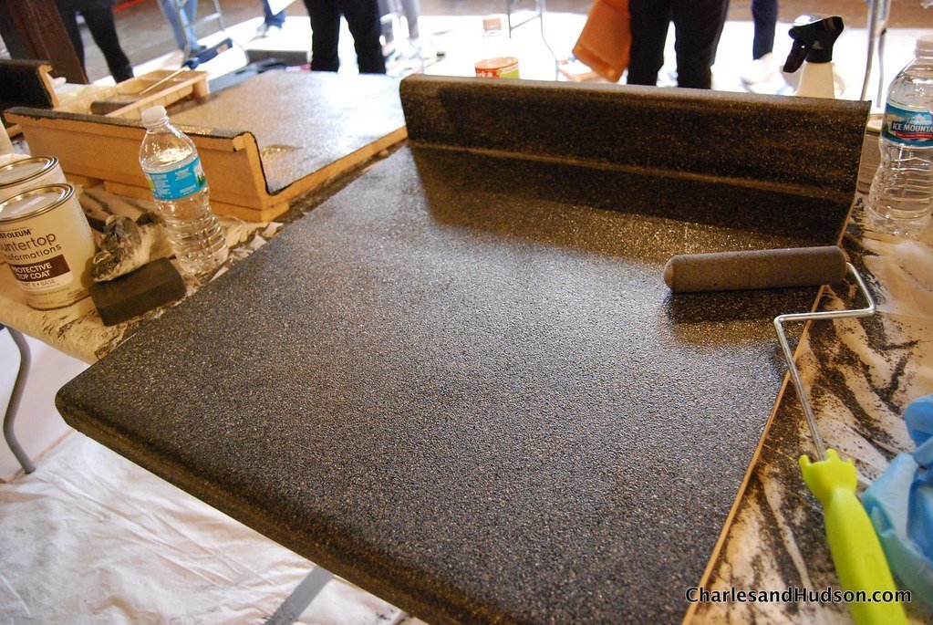
Laminate countertops had a long, celebrated run. Formica became a household name in the 1950s, prized for being affordable, easy to clean, and available in bold patterns that matched the era’s love of color. Decades later, those busy patterns and telltale plastic sheen are among the first things guests register as “old kitchen” the moment they step inside. The surface chips and peels over time, and no amount of cleaning makes aging laminate look like anything other than what it is.
Today’s quartz countertops have essentially replaced laminate as the go-to practical choice – non-porous, no sealing required, and available in hundreds of finishes that look far more expensive than they actually are. According to the 2025 Houzz Kitchen Trends Study, countertops are the single most commonly updated kitchen element, with 91% of renovating homeowners replacing them. It’s not just an aesthetic issue. Guests who cook know exactly what they’re looking at the moment they set something down on it.
Quick Compare: Laminate vs. Quartz Countertops
- Laminate: Low upfront cost, but chips, peels, and absorbs stains over time
- Quartz: Non-porous, requires no sealing, and resists scratches and heat far better
- Visual impact: Quartz finishes mimic stone convincingly; laminate’s plastic sheen is hard to disguise
- Resale signal: Laminate is one of the fastest ways to set a kitchen back visually by a full decade
The Kitchen Refresh Quiz
Is your kitchen stuck in a time warp? Test your knowledge on the design details that date a home and the high-impact fixes that modern guests notice most.
Think you caught the key details? Take the quick quiz and see how sharp your instincts really are.
#12 – A Countertop Microwave Eating Up Prime Real Estate
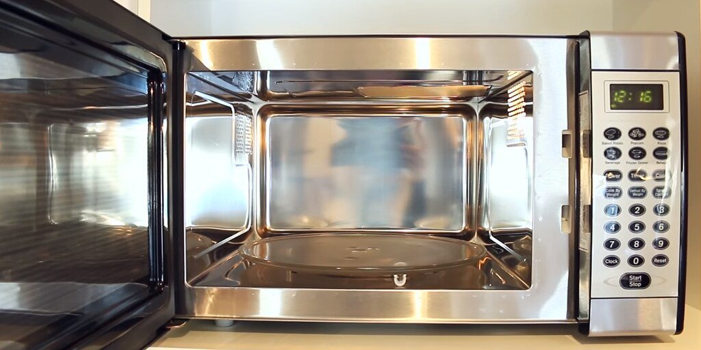
Ask any interior designer what single item makes a kitchen look instantly cluttered and dated, and a large countertop microwave lands near the top of the list every time. It squats there consuming two to three feet of workspace and telegraphing that the kitchen layout was never really thought through. The countertop microwave became standard in American kitchens in the 1980s and ’90s, back when counter space wasn’t treated as the precious commodity it is now.
Drawer-style and over-range microwaves have taken over in recently renovated kitchens, and guests who’ve spent time in updated homes will notice yours the moment they walk in. Over 90% of American households own a microwave – it’s not the appliance that’s the problem, it’s where it lives. Microwave drawers slide seamlessly into islands or lower cabinets, freeing up visual space while improving functionality. The best part? Simply relocating yours costs nothing at all.
#11 – White Appliances

White appliances were the aspirational kitchen choice of the 1980s – a crisp, clean break from the avocado green and harvest gold of the decade before. The problem is that the look never fully reclaimed its cool factor, and now a white refrigerator or dishwasher reads as either a rental unit or a kitchen that simply hasn’t been touched. White plastic ages poorly in a very specific, visible way: it yellows, scratches easily, and shows every smudge and fingerprint in unflattering detail.
Stainless steel remains the design-neutral, broadly acceptable choice for resale value and visual consistency. Matte black and panel-ready appliances are quickly becoming the new markers of a thoughtfully updated kitchen. Guests who’ve spent time in newly renovated homes make the comparison instantly and involuntarily – they can’t unsee it once they’ve seen it done right.
#10 – Ornate or Busy Patterned Backsplash Tiles
There’s a version of a patterned backsplash that looks intentional and high-end. And then there’s the version most people actually have – decorative border tiles and clashing ceramic patterns that felt bold in 1994 and now feel chaotic in a way that’s hard to look away from. Busy kitchen décor has been out of style for years, and backsplash tile is where that reality hits hardest because it covers so much visible wall space at direct eye level.
Guests don’t always know exactly why a kitchen feels off to them – but loud, competing tile patterns are one of the top invisible culprits. The eye needs somewhere to rest, and a pattern-heavy backsplash never allows for that. Designers consistently point to simple subway tile or a clean neutral field tile as the correction: it stops the visual noise and lets everything else in the kitchen actually be seen.
#9 – The All-White Kitchen (Circa 2015)
The all-white kitchen had a genuinely great run. For nearly a decade it was the default answer to “what does a modern kitchen look like” – bright, clean, aspirational, and endlessly photographable. But the look has aged faster than almost anyone predicted. It peaked during the early pandemic years when people craved sterile, airy spaces, and now that those years are behind us, the all-white kitchen has started to feel like exactly that: a time capsule from a specific cultural moment.
Designers are hearing the same thing from clients across the country: people want warmth, individuality, and a kitchen that feels lived-in rather than sanitized. As one designer put it, “white kitchens are classic, but people are starting to want more warmth and personality in their spaces.” Rich, earthy tones, wood finishes, and bold cabinet colors are now leading the charge. A few targeted wood accents or a bold color on the island can completely transform the feeling without touching a single white wall.
Worth Knowing
- Farmhouse style kitchens continue to fall out of favor – down to just 7% of renovations in the 2025 Houzz Kitchen Trends Study
- Transitional style is now the top renovation choice at 25%, followed by traditional style making a comeback at 14%
- “Warm minimalism” – earthy tones plus clean lines – is replacing the sterile all-white look across the board
- More than 4 in 5 homeowners (81%) change their kitchen’s style when they renovate
#8 – Builder-Grade Light Fixtures Over the Island
That basic drum shade or the generic brushed-nickel pendant that came standard with the house? Guests notice. Lighting over the island is one of the most visible design decisions in any kitchen, and a forgettable fixture communicates that no one really thought about it. Builder-grade lighting is the design equivalent of leaving the original brass doorknobs on a renovated house – technically functional, but quietly undermining everything around it.
A single great pendant light over an island can make the entire kitchen feel intentionally designed, even if nothing else has changed. Designers increasingly describe kitchen lighting as “the jewelry of the room” – it finishes the look and carries far more visual weight than its size suggests. The trend is moving toward sculptural designs and interesting materials that make a statement without overwhelming the space. This is one of the highest-impact, lowest-cost swaps available in any kitchen update.
#7 – Open Shelving Loaded with Mismatched Items
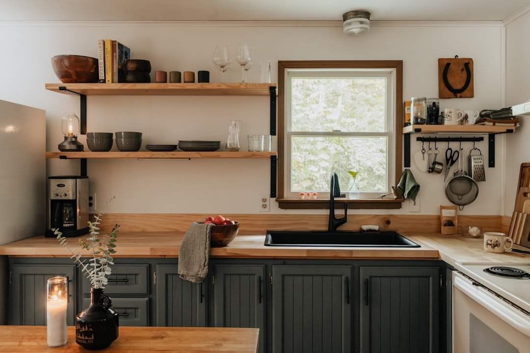
Open shelving had its Pinterest moment, and for a perfectly curated, meticulously maintained kitchen, it still looks great. But that’s not what most people’s open shelves actually look like. In practice, they become a magnet for mismatched dishes, dusty knick-knacks, expired spices, and a general visual chaos that guests scan the moment they enter the room. The concept looks beautiful in a magazine and quietly overwhelming in a real working kitchen.
The issue isn’t the shelving itself – it’s the collision between an aspirational look and the reality of daily life. Guests who see overcrowded open shelves don’t think “organized” or “homey.” They think “chaotic” and file it away as a general impression of disorder that follows them out the door. Replacing even one or two open sections with glass-front cabinet doors gives you the display factor without requiring museum-level curation to maintain it.
#6 – The Farmhouse Sink (Overexposed Edition)
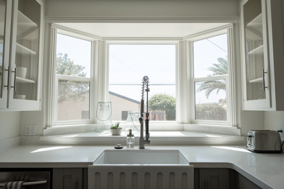
The farmhouse apron-front sink was a genuinely charming trend. Joanna Gaines made it feel warm, rustic, and authentically American, and millions of homeowners followed. But the sheer ubiquity of it has quietly flipped the script. What once felt like a personal design statement now signals something closer to “we watched a lot of Fixer Upper in 2017.” Modern farmhouse style as a whole is waning, and the apron sink is one of its most visible casualties.
Designers now point to the integrated or seamless sink – where the basin flows directly from the countertop material – as the upgrade that guests who’ve seen recent kitchen renovations will immediately notice. It looks deliberate, sleek, and genuinely current in a way the farmhouse sink no longer does. There’s also a practical complaint that keeps coming up: the exposed rim of an apron sink is genuinely difficult to keep clean, and guests who cook know exactly what they’re looking at.
#5 – Worn, Scratched, or Peeling Cabinet Doors
Cabinets cover more visual square footage than any other single element in a kitchen, which means guests are essentially looking at them everywhere they turn. Wear and tear – dents, scratches, chipping paint, peeling laminate – creates an impression of neglect that overrides everything else in the room. It doesn’t matter how spotless the countertops are. If the cabinet paint is flaking near the handles, the kitchen reads as tired, and that impression sticks.
This is one of the most common things guests observe but almost never mention – they absorb it as a general “the kitchen feels worn” feeling without being able to name exactly why. The fix doesn’t require replacing the cabinets. A fresh coat of paint and new hardware can close the visual gap entirely. New hardware alone – especially a switch from dated brass or brushed nickel to matte black or brushed gold – can make decade-old cabinets look like a deliberate, current design choice. The contrast is jarring in the best possible way.
#4 – Cluttered, Appliance-Heavy Countertops
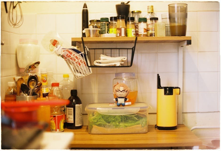
Walk into a kitchen where the blender, toaster, Keurig, stand mixer, knife block, and paper towel holder are all fighting for counter space, and something registers before you even consciously process it: there’s no breathing room. Research on environmental psychology consistently shows that cluttered spaces create measurable stress responses, and the kitchen counter is the first focal point guests’ eyes land on when they enter the room. They form their first impression of the kitchen based on that counter before they evaluate anything else.
The fastest design upgrade in any kitchen costs exactly nothing: clear the countertops. Appliance garages, pull-out shelves, or simply reassigning what lives on the counter versus inside a cabinet can transform the room’s feel in a single afternoon. Clean, open counter space reads as generous, intentional, and well-designed – even when everything else in the kitchen is unchanged. It’s the single highest-impact free change available, and almost no one does it.
Fast Facts
- 35% of American homeowners say their kitchen is in dire need of an update, according to a recent survey
- 84% of homeowners say they love their home more after completing a kitchen remodel
- In 2024, minor kitchen renovations yielded a 96% return on investment – the highest of any project type
- Decluttering countertops is consistently ranked among the top zero-cost upgrades before listing a home for sale
#3 – Dark or Greige Cabinetry That Misses the Mark
For a few years, dark navy and black cabinetry felt bold and sophisticated – a sharp reaction to all that white. But the moment passed faster than expected, and now an all-dark kitchen can easily read as heavy and oppressive rather than dramatic and intentional. “Black cabinetry had its moment, but now it’s gone,” says Erin Davis, lead designer at Mosaik Design and Remodeling. “Most clients feel it’s just too dark and doesn’t add the warmth they’re looking for.”
The same verdict applies to greige – that beige-gray blend that seemed like a failsafe neutral for years. Guests who follow even casual design content on social media will clock greige cabinetry as a mid-2010s choice, the visual equivalent of a chevron-patterned throw pillow. Warmer, earthier tones – terracotta, deep sage, warm cream – are where kitchens are moving now, and the shift is visible enough that the contrast with greige registers almost immediately.
#2 – Poor or Mismatched Lighting Layers
Most guests couldn’t tell you exactly what felt wrong about a kitchen – but lighting is almost always the invisible culprit. A single harsh overhead fixture with no under-cabinet task lighting creates blown-out surfaces on the countertops and dark corners everywhere else. The room looks either clinical or gloomy depending on the bulb, and neither reads as a kitchen anyone wants to cook in. Lighting is where the emotional atmosphere of a room actually lives, and most kitchens treat it as an afterthought.
The layered approach – ambient overhead light, task lighting under the cabinets, and an accent or decorative fixture – is something guests feel even when they can’t name it. A kitchen that has all three looks intentionally designed. One that doesn’t feels like something important is missing, even when everything else is in order. Under-cabinet LED strips cost less than fifty dollars and routinely top the list of highest-perceived-value kitchen upgrades for exactly this reason: they change how the whole room feels, not just how one surface looks.
“The focus is shifting to smaller, more intentional fixtures that highlight the architecture and craftsmanship instead of stealing the show.”
Corinne Ekle, Founder and Principal Designer, C2 Design
The Kitchen Refresh Quiz
Is your kitchen stuck in a time warp? Test your knowledge on the design details that date a home and the high-impact fixes that modern guests notice most.
Think you caught the key details? Take the quick quiz and see how sharp your instincts really are.
#1 – Outdated Hardware: The Detail That Quietly Dates Everything Else
Here’s what most people get completely wrong: they obsess over big-ticket upgrades – countertops, cabinets, appliances – while ignoring the one detail that guests’ eyes land on constantly throughout every single interaction in the kitchen. Cabinet and drawer hardware. Brushed nickel from 2003, brass knobs from the early ’90s, or mismatched pulls that accumulated over years of replacement – guests register these details every time they open a drawer, reach for a cabinet, or lean against the island. They don’t think about it consciously. They just feel it.
The fix is genuinely cheap: a full set of new hardware for an average kitchen runs somewhere between one hundred and three hundred dollars and takes a Sunday afternoon to install. Yet it creates a before-and-after effect that even people with zero interest in design describe as “the kitchen feels completely different.” No single item on this entire list offers a better return per dollar spent. It’s small, it’s fast, it’s affordable – and it’s the detail your guests are quietly registering first, last, and every single time in between.
Why It Stands Out
- Hardware is the most-touched surface in any kitchen – guests interact with it on every visit
- A full kitchen hardware swap typically costs $100–$300 and requires no professional help
- Matte black, brushed gold, and unlacquered brass are the finishes leading current renovations
- Mismatched or builder-grade pulls undermine even brand-new countertops and freshly painted cabinets
- Hardware is the one change that makes guests say “did you renovate?” without a single cabinet being replaced
Your kitchen doesn’t need a full renovation to stop reading as outdated. The items guests notice most – honey oak cabinets, fluorescent tubes, cluttered countertops, worn hardware, that lonely countertop microwave – are almost all fixable without a contractor. The real surprise is that the costliest items on this list are often not what guests clock first. It’s the small, overlooked details that land hardest: the hardware finish, the quality of the light, the visual noise of a busy backsplash. Fix those first, and the whole room shifts. Which one is sitting in your kitchen right now?